|
View the web version

Hi there, hope you're having a great Friday!
This is Colm and Simon from CommerceGurus, with a handpicked weekly roundup of eCommerce articles.

New feature alert!
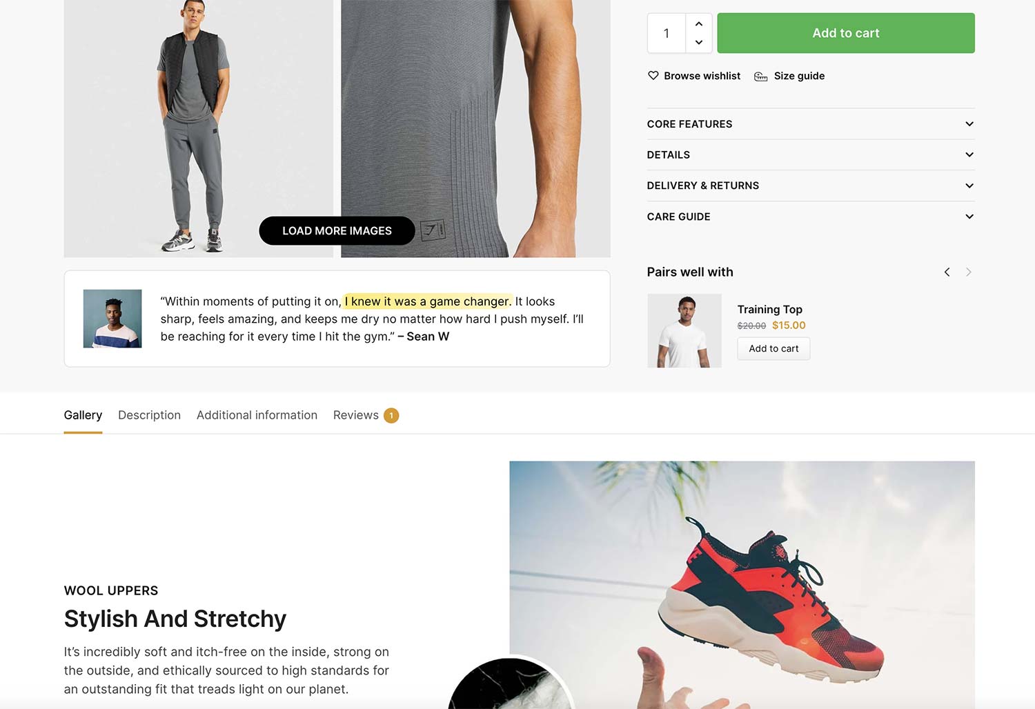
Shoptimizer 2.8+ includes a new option to enable you to display cross-sells in the “Buy box” area of your product pages.
Normally in WooCommerce, cross-sells are displayed only on the cart page, but this seems a bit of a waste.
Including native WooCommerce cross-sells in a more prominent part of the user purchasing journey can be an excellent way to introduce compatible items to a potential purchaser without being so prominent that it takes away the product they are looking at.
You can see how this looks on a Shoptimizer demo product.
We have a new documentation article which explains how you can implement this on your own Shoptimizer store.
Learn How to Add Cross-sells to the Buy Box on Product Pages
The blog post on ConversionWise delves into best practices for creating effective product pages and landing pages, particularly for mobile users.
It highlights key elements like clear, concise headlines, compelling CTAs, and the strategic use of social proof to enhance conversions.
The post also includes a critique of four landing pages, offering specific suggestions for improvements such as optimizing page load speed, refining visual content, and incorporating user-friendly features like FAQs.
The article emphasizes the significance of trust-building elements such as customer reviews, trust badges, and transparent shipping information.
This approach can significantly boost conversion rates by creating a more engaging and trustworthy user experience.
Uncover Product Page Best Practices from ConversionWise
Alex Russell has written a very interesting piece on the evolution of web and mobile technology, beginning with how early browser development for Android struggled with hardware constraints and system limitations.
Yet despite advancements, web developers have failed to adapt to mobile-first realities, leading to bloated, inefficient web experiences, particularly for users with budget devices.
Russell criticizes the widespread adoption of JavaScript-heavy frameworks, arguing that they undermine user experience and exacerbate digital inequality, especially in contexts like public services, where efficient design is crucial for accessibility.
It's a fascinating piece worth reading for anyone building experiences for a large audience.
Read Reckoning: Part 1 — The Landscape
Once-great social media and blogging platform Tumblr has gone through a number of big changes in recent years, and another one is right around the corner.
Parent company Automattic says it is migrating all Tumblr blogs - more than half a billion in number - to the WordPress back end.
In a blog post announcing the initiative, Automattic is careful to note that it doesn't want anything about the front-end user experience of Tumblr to change.
Automattic’s team will be able to build tools and features that work on both services, while Tumblr will be able to take advantage of the open source developments that take place on WordPress.org.
Learn More about Tumblr's Move to WordPress
Landingfolio features the best landing page designs, templates, components and more on the web. If you're designing or thinking about creating a landing page, get inspired by many beautiful real-life examples.
Discover Landingfolio - Landing Page Design Inspiration
Store owners, we want to hear from you!
We'd love to hear how your business started. Get your store featured in a future issue and reach thousands of subscribers!
Submit your story
|
That's it for this edition. Simply reply to this email if you have any questions or suggestions, we read every message.
You can also take a look at our entire back catalog of newsletters.
Have a great week and best of luck with your projects!
Colm and Simon from CommerceGurus

|